
Input checkbox component
The check box component is used for submitting check box selections within forms. It implements value tests and custom designs.
Settings:
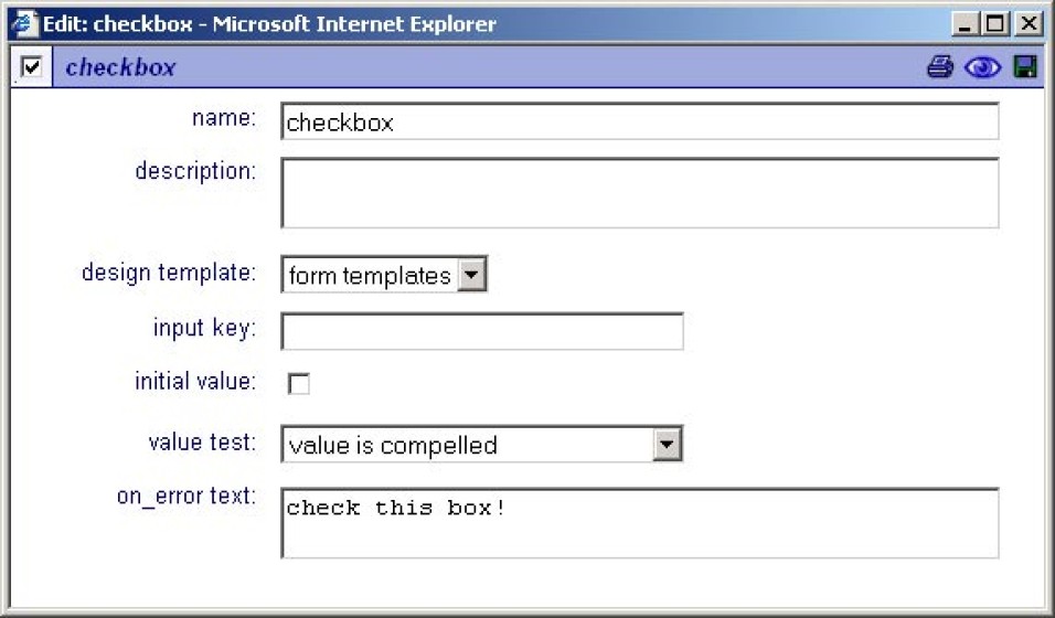
Name
The name of the 'checkbox', this name is used as the input 'key' unless a 'input key' value is given.
Description
Description text of the 'checkbox'.
Design template
If available, specific 'input' designs can be selected here.
Input key
This is the 'technical' input name and is optionally used for application and database forms. When the key is blank, the input name is used as the key. Beware that input keys must be unique in a form for the form to function correctly.
Initial value
This is the initial value of the input.
Value test
When selected the given value will be tested. The following options are available,
none, the value is not tested.
value is compelled, the value is tested for occurrence.
On error text
This is the text that is presented to the user when an error occurred on form post.