Input selectbox component

The select box component is used for submitting selections, etc. It implements value tests, designs and navigation designs.

Settings:
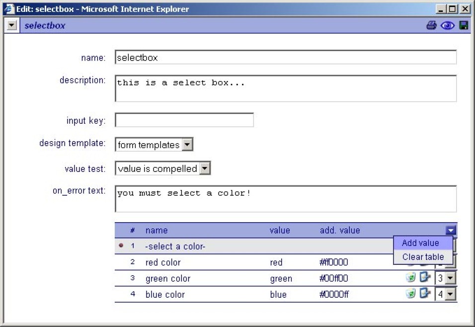
Name
The name of the 'selectbox', this name is used as the input 'key' unless a 'input key' value is given.
Description
Description text of the 'selectbox'.
Design template
If available, specific 'input' designs can be selected here.
Input key
This is the 'technical' input name and is optionally used for application and database forms. When the key is blank, the input name is used as the key. Beware that input keys must be unique in a form for the form to function correctly.
Value test
When selected the given value will be tested. The following options are available,
none, the value is not tested.
value is compelled, the value is tested for occurrence.
On error text
This is the text that is presented to the user when an error occurred on form post.
Option value table:
This table contains the options for the selectbox
-Use the dropdown box to add values to the table or to clear the table.
-Use the 'recycle-bin' button to remove options from the table.
-Use the 'edit' button to edit options.
-Use the item dropdown boxes to set the order of the options.
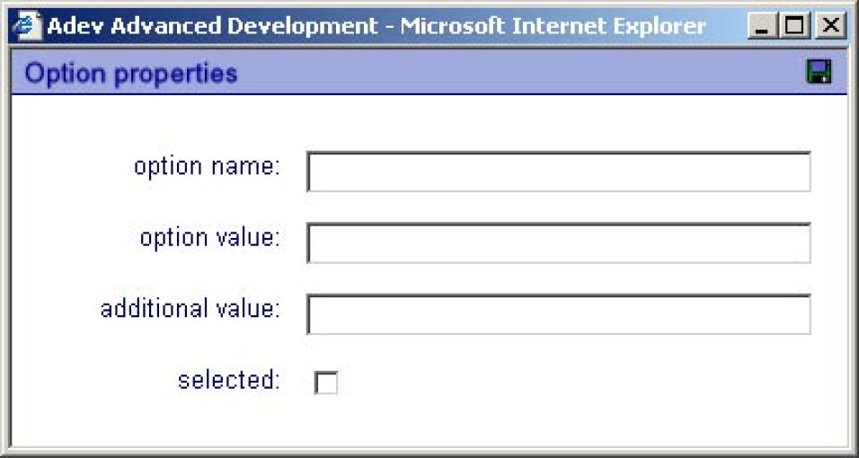
Option properties:

Option name
The presentation name of the option.
Option value
The posted value when selected.
Additional value
Additional value used for specific design solutions
Selected
Specifies the initially selected option
